Make sense of your
knowledge graphs|
Visualize and analyze large network graphs and machine learning embeddings on your own device, no servers needed.
Showcase
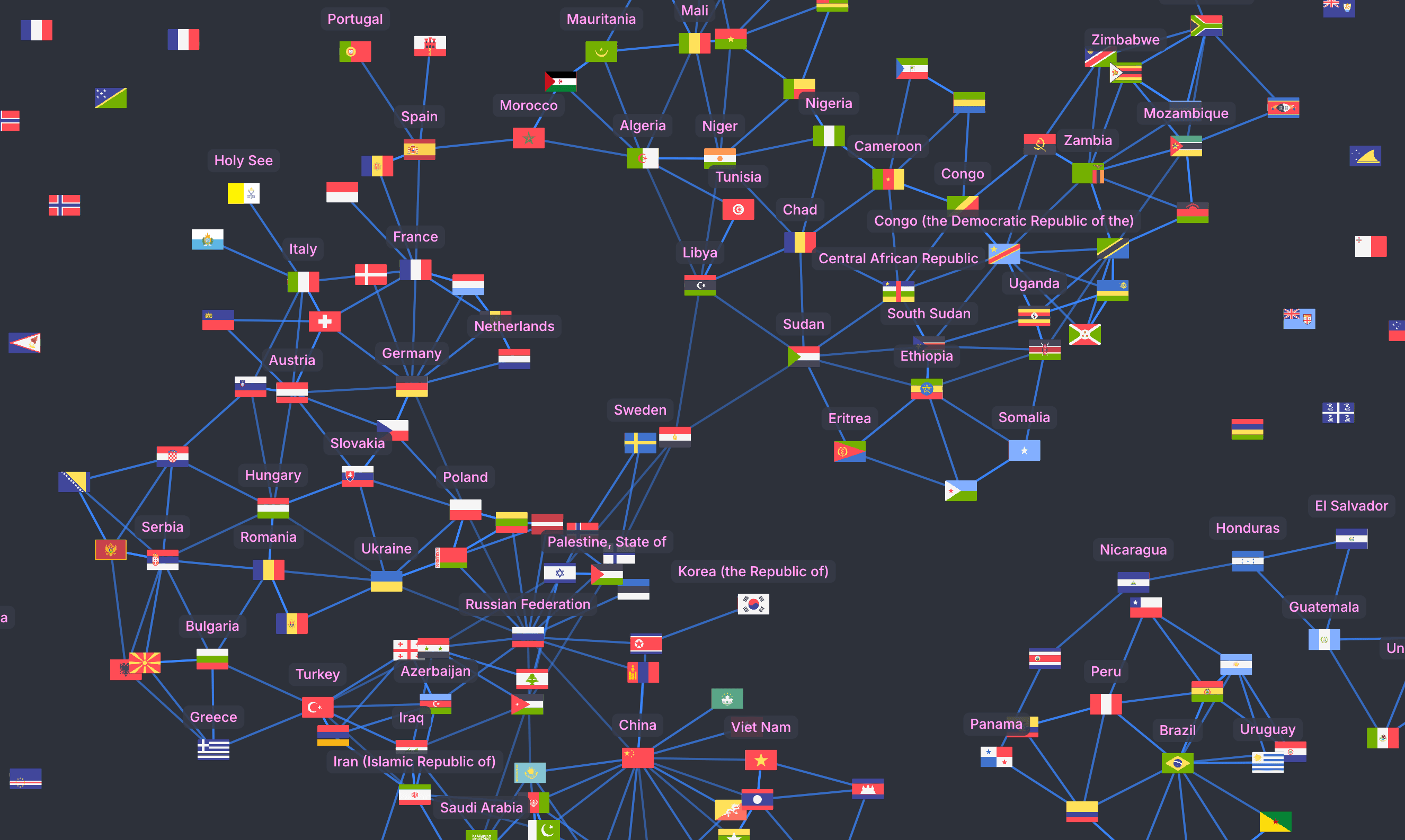
Country Borders
This graph maps countries as points and land borders as links between them. Dense clusters highlight highly interconnected regions like, while isolated points represent island nations and territories with no land neighbors.
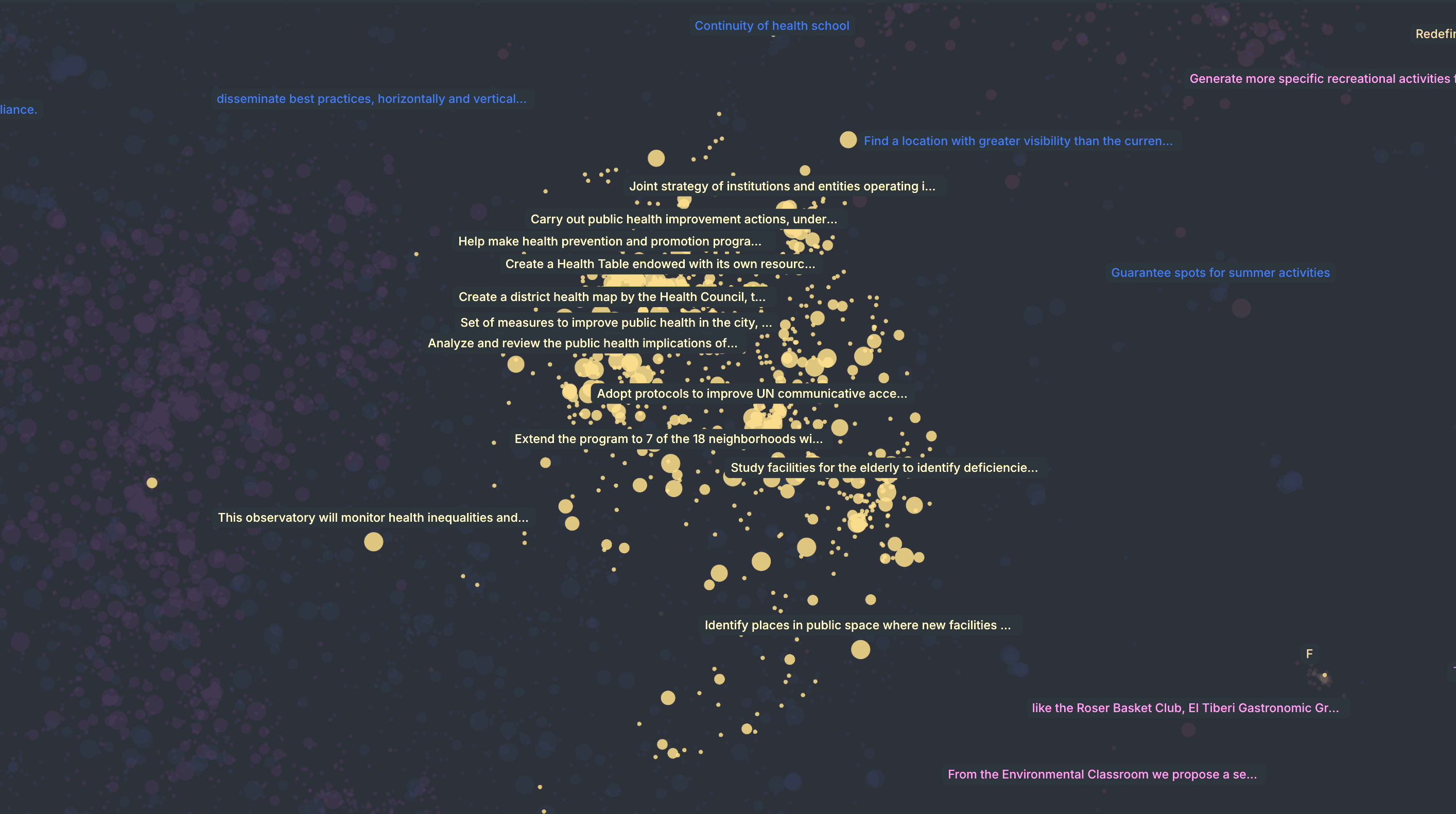
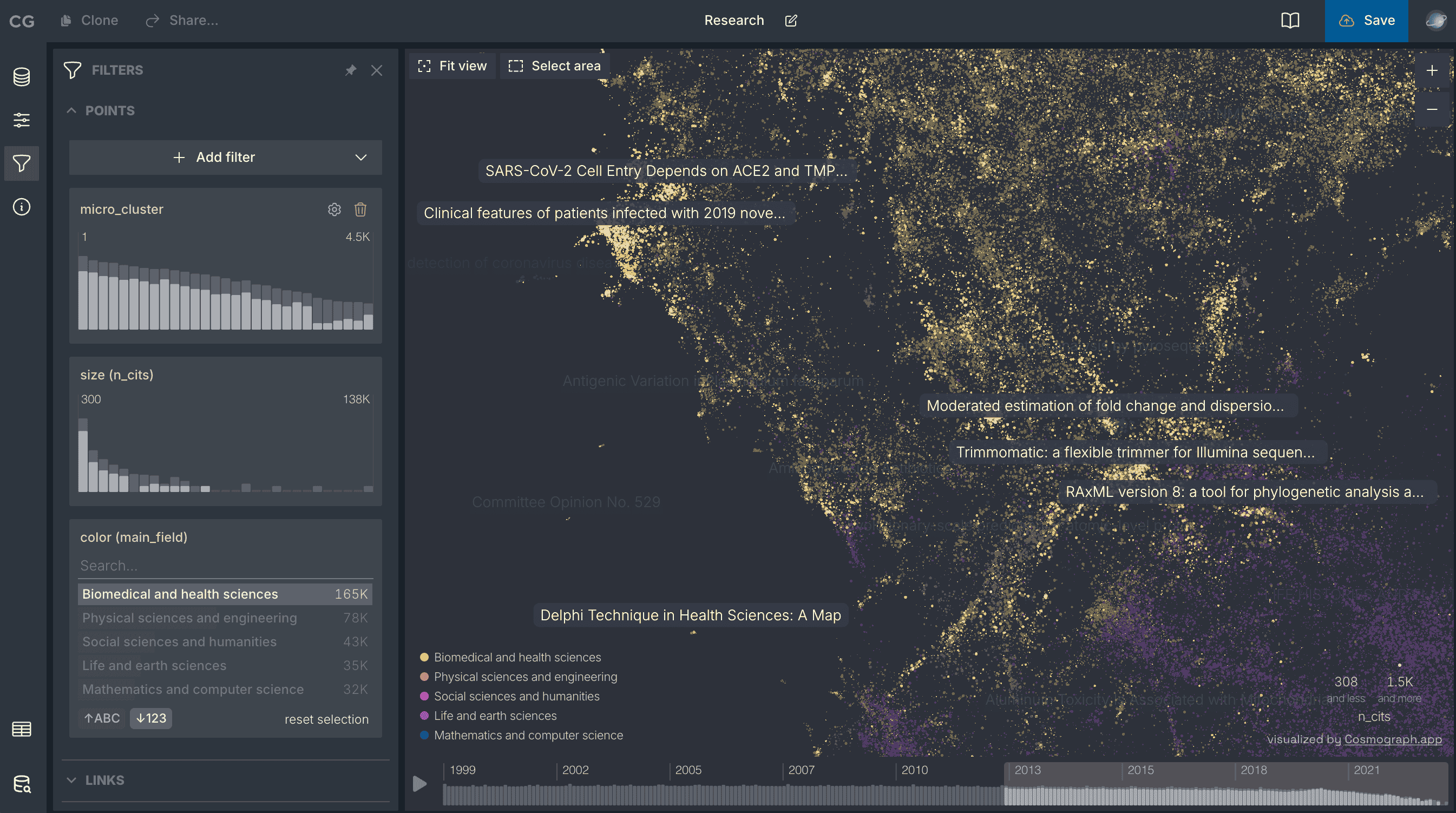
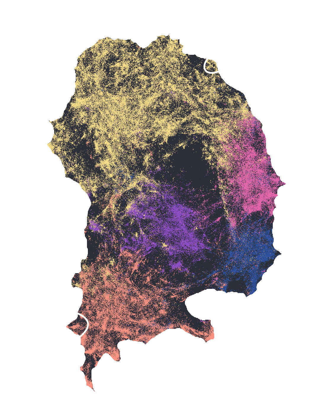
Barcelona City Proposals
Visualizing the most recurrent topics in more than 30K citizen proposals submitted to the participatory platform decidim.barcelona over an eight-year period. Created by Diego Arredondo.
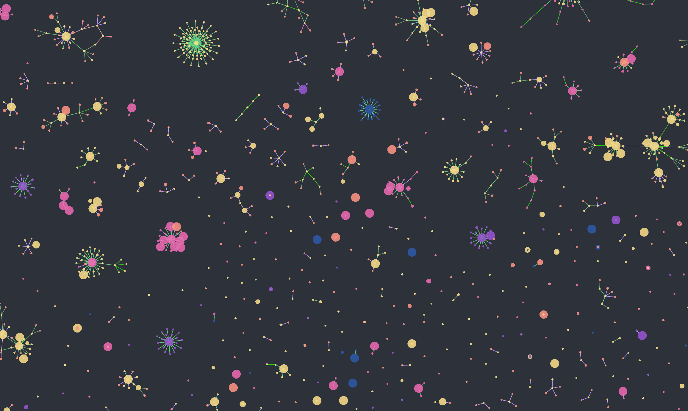
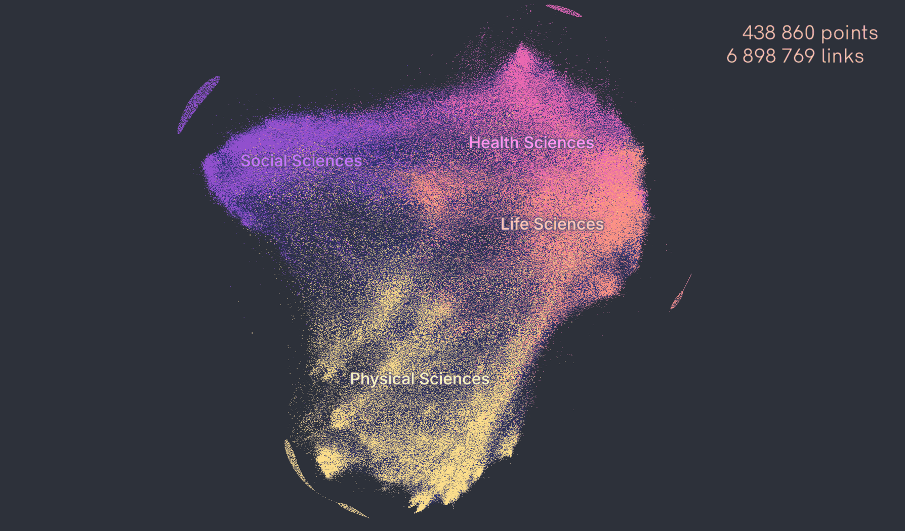
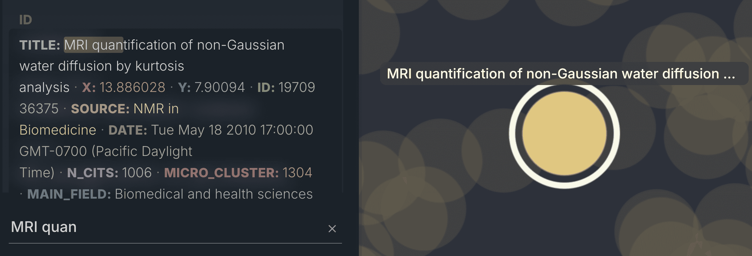
AI Model Atlas
Model Atlas visualizes entire populations of machine-learning models as an interconnected graph, showing how models evolve, relate, and transform through fine-tuning. Learn more at horwitz.ai/model-atlas.
Why people love Cosmograph
The fastest single-node graph analytics toolkit
The fastest web-based force network graph layout and rendering. Working with massive datasets. Built on top of DuckDB (the fastest in-memory analytics database).
Privacy-first
Your data stays local unless you decide to share it

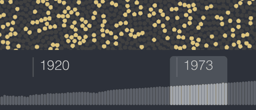
Time dimension
See you dataset evolving over time with the help of the Timeline
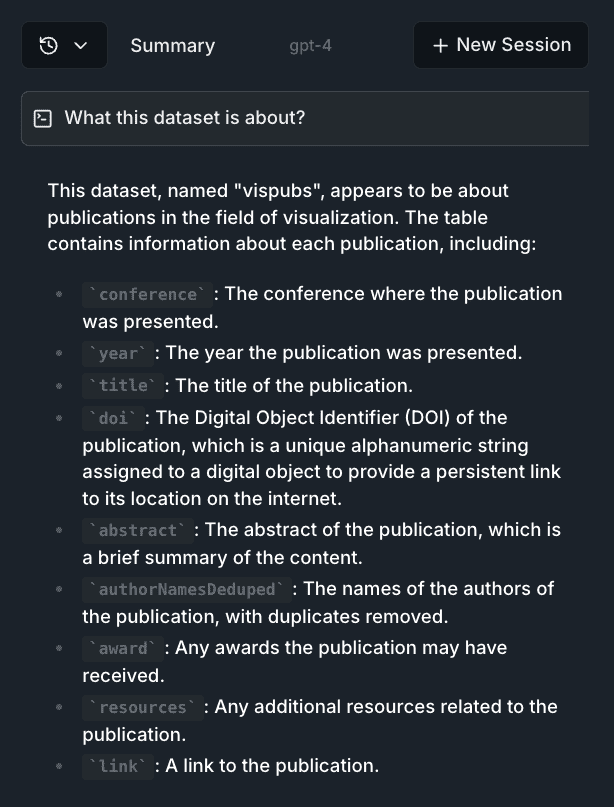
Chat with your dataclosed beta
Ask AI questions about your data and get answers in real-time
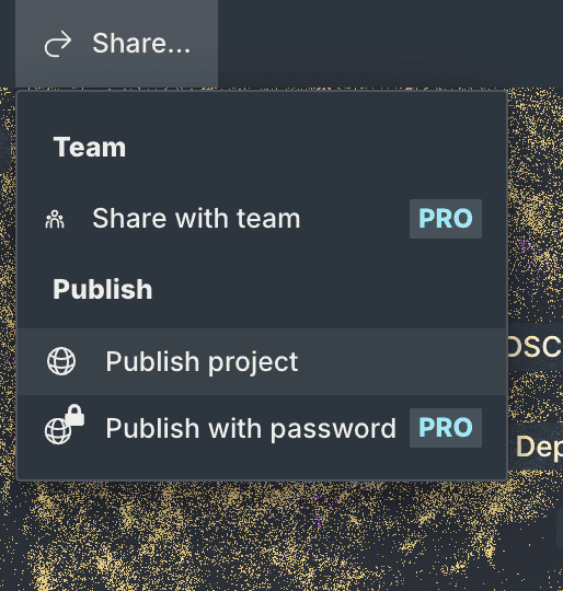
Graph sharing
Easily share your graph with colleagues or integrate it directly into your website.
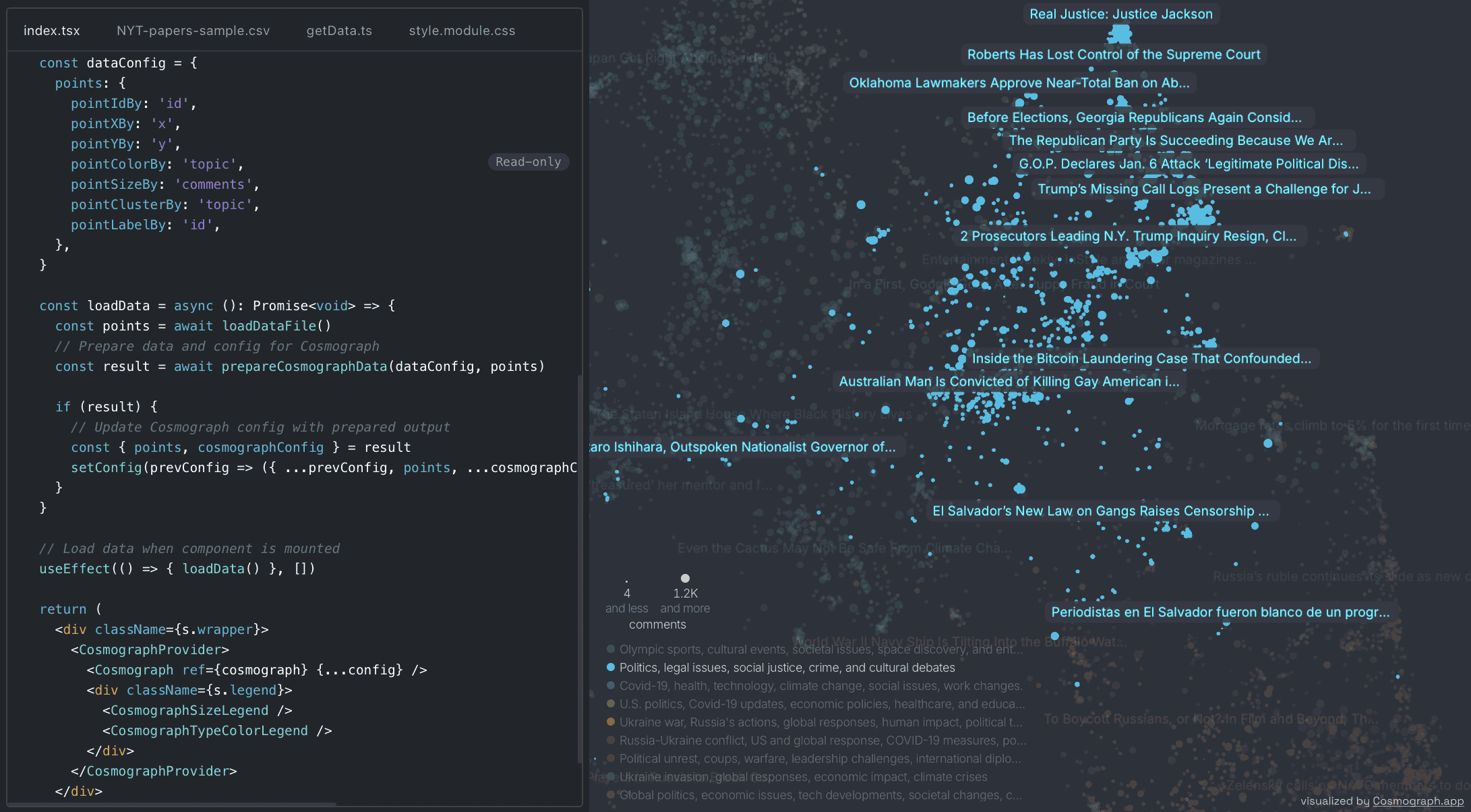
By data analysts, for data analysts
Start in Python notebook, continue in the browser, build your web app with our library!

Collaborationclosed beta
Work with your team on the same graph
Powerful filtering & search
Filter your data through histograms, strip away noise, and spot the needle in the haystack: distributions, outliers, patterns.
Trusted by top researchers and engineers
Web developer?
Try Cosmograph library!
Want to add Cosmograph capabilities into your own project?
Check out our React and TypeScript library.
 Read the docs
 Try examples
 Follow us on GitHub
Subscribe to updates
Subscribe to be the first to learn about new updates, features and discounts